
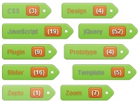
DEMO
áp dụng vào blogspot
Trước khi áp dụng thủ thuật này vào blog của bạn,bạn phải chắc chắn là blog của bạn có sẵn tiện ích này và vào bố cục bật tiện ích này lên và nhớ đánh dấu vào ô cloud và ô hiển thị số bài đăng trên nhãn.Sau đó vào chỉnh sửa mẫu tìm tới thẻ ]]></b:skin>
Và dán đoạn CSS sau vào ngay trước nó
.label-size{display: inline-block;padding: 0px 10px;height: 29px;line-height:29px;border-radius: 5px;font-weight:bold;font-size:12px;text-decoration:none;}
.label-size{
border: 1px solid #769e42;
box-shadow: inset 0 1px 0 #c5e59c ;
background-color: #9ed35a;
text-shadow: 0px 1px 1px #6ea23b;
color: #fff;
background-image: linear-gradient(bottom, rgb(125,196,64) 0%, rgb(157,210,88) 100%);
background-image: -o-linear-gradient(bottom, rgb(125,196,64) 0%, rgb(157,210,88) 100%);
background-image: -moz-linear-gradient(bottom, rgb(125,196,64) 0%, rgb(157,210,88) 100%);
background-image: -webkit-linear-gradient(bottom, rgb(125,196,64) 0%, rgb(157,210,88) 100%);
background-image: -ms-linear-gradient(bottom, rgb(125,196,64) 0%, rgb(157,210,88) 100%);
}
.label-size:hover{
background-color: #b7fa66;
background-image: linear-gradient(top, #b7fa66 0%, #7ec940 100%);
background-image: -o-linear-gradient(top, #b7fa66 0%, #7ec940 100%);
background-image: -moz-linear-gradient(top, #b7fa66 0%, #7ec940 100%);
background-image: -webkit-linear-gradient(top, #b7fa66 0%, #7ec940 100%);
background-image: -ms-linear-gradient(top, #b7fa66 0%, #7ec940 100%);
}
.label-size:active{
background-image: linear-gradient(top, rgb(125,196,64) 0%, rgb(157,210,88) 100%);
background-image: -o-linear-gradient(top, rgb(125,196,64) 0%, rgb(157,210,88) 100%);
background-image: -moz-linear-gradient(top, rgb(125,196,64) 0%, rgb(157,210,88) 100%);
background-image: -webkit-linear-gradient(top, rgb(125,196,64) 0%, rgb(157,210,88) 100%);
background-image: -ms-linear-gradient(top, rgb(125,196,64) 0%, rgb(157,210,88) 100%);
}
.label-size{
display:inline-block;
border-radius: 5px 0 0 5px;
border-right-width:0;
position:relative;
z-index:5;
margin-right: 20px;
margin-bottom: 10px;
}
.label-size:after{
content: " ";
width: 22px;
height: 22px;
line-height: 18px;
font-size:25px;
border-top: 1px solid #769e42;
border-right: 1px solid #769e42;
box-shadow: inset 0 1px 0 #c5e59c ;
background-color: #9ed35a;
text-shadow: 0px 1px 1px #7eac46;
border-radius: 3px 7px 3px 0;
color: #fff;
background-image: linear-gradient(135deg, rgb(125,196,64) 0%, rgb(157,210,88) 100%);
background-image: -o-linear-gradient(135deg, rgb(125,196,64) 0%, rgb(157,210,88) 100%);
background-image: -moz-linear-gradient(135deg, rgb(125,196,64) 0%, rgb(157,210,88) 100%);
background-image: -webkit-linear-gradient(135deg, rgb(125,196,64) 0%, rgb(157,210,88) 100%);
background-image: -ms-linear-gradient(135deg, rgb(125,196,64) 0%, rgb(157,210,88) 100%);
position:absolute;
top: 3px;
right: -12px;
z-index:-3;
-webkit-transform: rotate(45deg);  /* Saf3.1+, Chrome */
-moz-transform: rotate(45deg);  /* FF3.5+ */
-ms-transform: rotate(45deg);  /* IE9 */
-o-transform: rotate(45deg);  /* Opera 10.5 */
transform: rotate(45deg);
filter: progid:DXImageTransform.Microsoft.Matrix(/* IE6–IE9 */
M11=0.7071067811865476, M12=-0.7071067811865475, M21=0.7071067811865475, M22=0.7071067811865476, sizingMethod='auto expand');
zoom: 1;
}
.label-size:hover:after{
background-color: #b7fa66;
background-image: linear-gradient(-45deg, #b7fa66 0%, #7ec940 100%);
background-image: -o-linear-gradient(-45deg, #b7fa66 0%, #7ec940 100%);
background-image: -moz-linear-gradient(-45deg, #b7fa66 0%, #7ec940 100%);
background-image: -webkit-linear-gradient(-45deg, #b7fa66 0%, #7ec940 100%);
background-image: -ms-linear-gradient(-45deg, #b7fa66 0%, #7ec940 100%);
}
.label-size:active:after{
background-image: linear-gradient(-45deg, rgb(125,196,64) 0%, rgb(157,210,88) 100%);
background-image: -o-linear-gradient(-45deg, rgb(125,196,64) 0%, rgb(157,210,88) 100%);
background-image: -moz-linear-gradient(-45deg, rgb(125,196,64) 0%, rgb(157,210,88) 100%);
background-image: -webkit-linear-gradient(-45deg, rgb(125,196,64) 0%, rgb(157,210,88) 100%);
background-image: -ms-linear-gradient(-45deg, rgb(125,196,64) 0%, rgb(157,210,88) 100%);
}
.label-size:before{
content: " ";
height:5px;
width:5px;
display:block;
position:absolute;
right:-3px;
top:11px;
background-color: #fcfdf5;
border: 1px solid #83ab52;
border-radius:5px;
box-shadow: 0 1px 0 #b2ddd83;
}
.label-size span{
padding:2px 5px;
border: 1px solid #9e5c26;
border-radius: 5px;
box-shadow: inset 0 1px 0 #f5bf8c;
background-color: #ed943f;
text-shadow: 0px 1px 1px #000;
margin-left: 10px;
background-image: linear-gradient(bottom, rgb(211,95,32) 0%, rgb(223,131,45) 100%);
background-image: -o-linear-gradient(bottom, rgb(211,95,32) 0%, rgb(223,131,45) 100%);
background-image: -moz-linear-gradient(bottom, rgb(211,95,32) 0%, rgb(223,131,45) 100%);
background-image: -webkit-linear-gradient(bottom, rgb(211,95,32) 0%, rgb(223,131,45) 100%);
background-image: -ms-linear-gradient(bottom, rgb(211,95,32) 0%, rgb(223,131,45) 100%);
}
#Label1 {height:210px !important;}
Điều chỉnh trị số height:210px sao cho phù hợp với số lượng nhãn trên blog(nhiều nhãn thì trị số phải đủ lớn để các nhãn không bị đè lên nhau)